animation 动画
利用 transition 属性可以实现简单的过渡动画,但过渡动画仅能指定开始和结束两个状态,整个过程都是由特定的函数来控制的,不是很灵活。我们可以使用 animation 实现更为复杂的动画。
CSS 中的动画类似于 flash 中的逐帧动画,表现细腻并且非常灵活,使用 CSS 中的动画可以取代许多网页中的动态图像、Flash 动画或者 JavaScript 实现的特殊效果。
1. @keyframes 规则—— 动画中的关键帧
要创建 CSS 动画,首先需要了解 @keyframes 规则,@keyframes 规则用来定义动画各个阶段的属性值,类似于 flash 动画中的关键帧,语法格式如下:
@keyframes animationName {
  from {
    properties: value;
  }
  percentage {
    properties: value;
  }
  to {
    properties: value;
  }
}
// 或者
@keyframes animationName {
  0% {
    properties: value;
  }
  percentage {
    properties: value;
  }
  100% {
    properties: value;
  }
}
语法说明如下:
animationName:表示动画的名称;from:定义动画的开头,相当于 0%;percentage:定义动画的各个阶段,为百分比值,可以添加多个;to:定义动画的结尾,相当于 100%;properties:不同的样式属性名称,例如 color、left、width 等等。
下面我们来看一个简单的 @keyframes 规则示例:
@keyframes ball {
  0% {
    top: 0px;
    left: 0px;
  }
  25% {
    top: 0px;
    left: 350px;
  }
  50% {
    top: 200px;
    left: 350px;
  }
  75% {
    top: 200px;
    left: 0px;
  }
  100% {
    top: 0px;
    left: 0px;
  }
}
动画创建好后,还需要将动画应用到指定的 HTML 元素。要将动画应用到指定的 HTML 元素需要借助 CSS 属性,CSS 中提供了如下所示的动画属性:
animation-name:设置需要绑定到元素的动画名称;animation-duration:设置完成动画所需要花费的时间,单位为秒或毫秒,默认为 0;animation-timing-function:设置动画的速度曲线,默认为 ease;animation-fill-mode:设置当动画不播放时(动画播放完或延迟播放时)的状态;animation-delay:设置动画开始之前的延迟时间,默认为 0;animation-iteration-count:设置动画被播放的次数,默认为 1;animation-direction:设置是否在下一周期逆向播放动画,默认为 normal;animation-play-state:设置动画是正在运行还是暂停,默认是 running;animation:所有动画属性的简写属性。
下面就来详细介绍一下上述属性的使用。
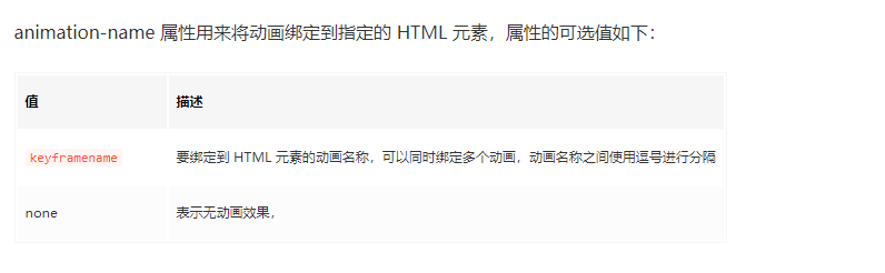
2. animation-name 动画名称
animation-name 属性用来将动画绑定到指定的 HTML 元素,属性的可选值如下:
<!DOCTYPE html>
<html>
  <head>
    <style>
      @keyframes ball {
        0% {
          top: 0px;
          left: 0px;
        }
        25% {
          top: 0px;
          left: 350px;
        }
        50% {
          top: 200px;
          left: 350px;
        }
        75% {
          top: 200px;
          left: 0px;
        }
        100% {
          top: 0px;
          left: 0px;
        }
      }
      div {
        width: 100px;
        height: 100px;
        border-radius: 50%;
        border: 3px solid black;
        position: relative;
        animation-name: ball;
        animation-duration: 2s;
      }
    </style>
  </head>
  <body>
    <div></div>
  </body>
</html>
注意:要想让动画成功播放,还需要定义 animation-duration 属性,否则会因为 animation-duration 属性的默认值为 0,导致动画并不会播放。
3. animation-duration 动画完成一个周期所需要花费的时间
animation-duration 属性用来设置动画完成一个周期所需要花费的时间,单位为秒或者毫秒。示例代码如下:
<!DOCTYPE html>
<html>
  <head>
    <style>
      @keyframes ball {
        0% {
          top: 0px;
          left: 0px;
        }
        25% {
          top: 0px;
          left: 350px;
        }
        50% {
          top: 200px;
          left: 350px;
        }
        75% {
          top: 200px;
          left: 0px;
        }
        100% {
          top: 0px;
          left: 0px;
        }
      }
      div {
        width: 100px;
        height: 100px;
        border-radius: 50%;
        border: 3px solid black;
        position: relative;
        animation-name: ball;
        animation-duration: 4s;
      }
    </style>
  </head>
  <body>
    <div></div>
  </body>
</html>
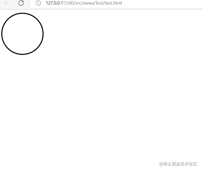
运行结果如下图所示 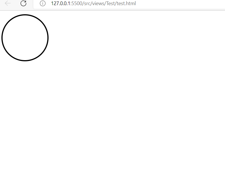 图:animation-duration 属性演示
提示:动画若想成功播放,必须要定义 animation-name 和 animation-duration 属性。
4. animation-timing-function 动画播放的速度曲线
animation-timing-function 属性用来设置动画播放的速度曲线,通过速度曲线的设置可以使动画播放的更为平滑。animation-timing-function 属性的可选值如下表所示: 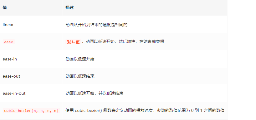
示例代码如下:
<!DOCTYPE html>
<html>
  <head>
    <style>
      @keyframes ball {
        0% {
          left: 0px;
        }
        50% {
          left: 350px;
        }
        100% {
          left: 0px;
        }
      }
      div {
        width: 100px;
        height: 100px;
        border-radius: 50%;
        border: 3px solid black;
        text-align: center;
        line-height: 100px;
        position: relative;
        animation-name: ball;
        animation-duration: 2s;
      }
      .one {
        animation-timing-function: ease;
      }
      .two {
        animation-timing-function: ease-in;
      }
      .three {
        animation-timing-function: ease-out;
      }
      .four {
        animation-timing-function: ease-in-out;
      }
    </style>
  </head>
  <body>
    <div class="one">ease</div>
    <div class="two">ease-in</div>
    <div class="three">ease-out</div>
    <div class="four">ease-in-out</div>
  </body>
</html>
运行结果如下图所示: 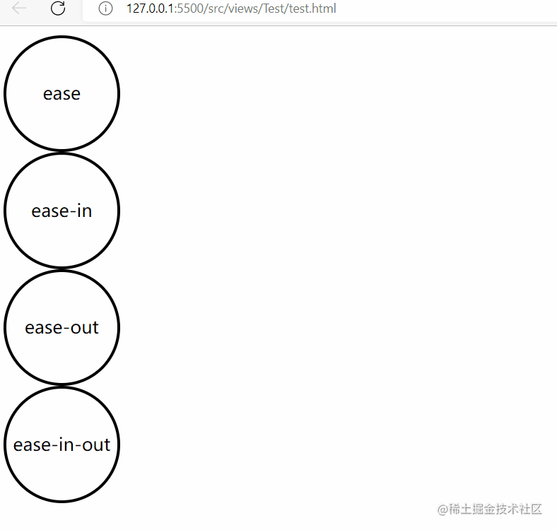
5.animation-fill-mode (开始播放之前或播放结束之后)动画的状态
animation-fill-mode 属性用来设置当动画不播放时(开始播放之前或播放结束之后)动画的状态(样式),属性的可选值如下: 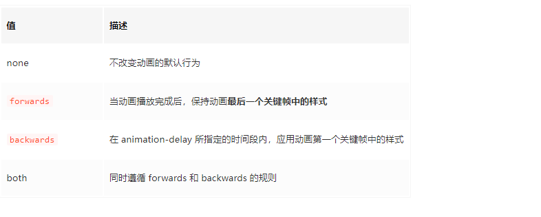
示例代码如下:
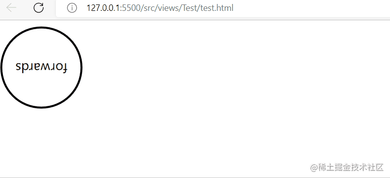
<!DOCTYPE html>
<html>
  <head>
    <style>
      @keyframes box {
        0% {
          transform: rotate(0);
        }
        50% {
          transform: rotate(0.5turn);
        }
        100% {
          transform: rotate(1.5turn);
        }
      }
      div {
        width: 100px;
        height: 100px;
        border-radius: 50%;
        float: left;
        border: 3px solid black;
        text-align: center;
        line-height: 100px;
        position: relative;
        animation-name: box;
        animation-duration: 2s;
        animation-iteration-count: 1;
        animation-fill-mode: forwards;
      }
    </style>
  </head>
  <body>
    <div>forwards</div>
  </body>
</html>
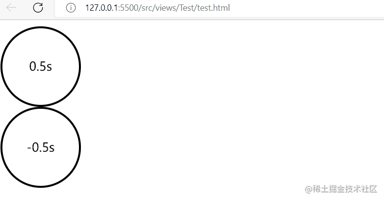
6. animation-delay 动画开始播放前的延迟时间
animation-delay 属性用来定义动画开始播放前的延迟时间,单位为秒或者毫秒,属性的语法格式如下:
animation-delay: time;
其中参数 time 就是动画播放前的延迟时间,参数 time 既可以为正值也可以为负值。参数值为正时,表示延迟指定时间开始播放;参数为负时,表示跳过指定时间,并立即播放动画。 示例代码如下:
<!DOCTYPE html>
<html>
  <head>
    <style>
      @keyframes ball {
        0% {
          left: 0px;
        }
        50% {
          left: 350px;
        }
        100% {
          left: 0px;
        }
      }
      div {
        width: 100px;
        height: 100px;
        border-radius: 50%;
        border: 3px solid black;
        text-align: center;
        line-height: 100px;
        position: relative;
        animation-name: ball;
        animation-duration: 2s;
      }
      .one {
        animation-delay: 0.5s;
      }
      .two {
        animation-delay: -0.5s;
      }
    </style>
  </head>
  <body>
    <div class="one">0.5s</div>
    <div class="two">-0.5s</div>
  </body>
</html>
运行结果如下图所示:
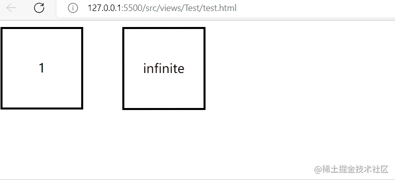
7. animation-iteration-count 动画播放的次数
animation-iteration-count 属性用来定义动画播放的次数,属性的可选值如下: 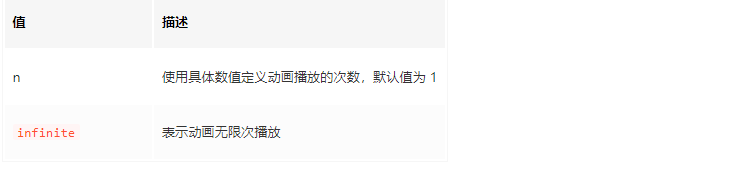
示例代码如下:
<!DOCTYPE html>
<html>
  <head>
    <style>
      @keyframes box {
        0% {
          transform: rotate(0);
        }
        50% {
          transform: rotate(0.5turn);
        }
        100% {
          transform: rotate(1turn);
        }
      }
      div {
        width: 100px;
        height: 100px;
        float: left;
        border: 3px solid black;
        text-align: center;
        line-height: 100px;
        position: relative;
        animation-name: box;
        animation-duration: 2s;
      }
      .one {
        animation-iteration-count: 1;
      }
      .two {
        margin-left: 50px;
        animation-iteration-count: infinite;
      }
    </style>
  </head>
  <body>
    <div class="one">1</div>
    <div class="two">infinite</div>
  </body>
</html>
运行结果如下图所示:
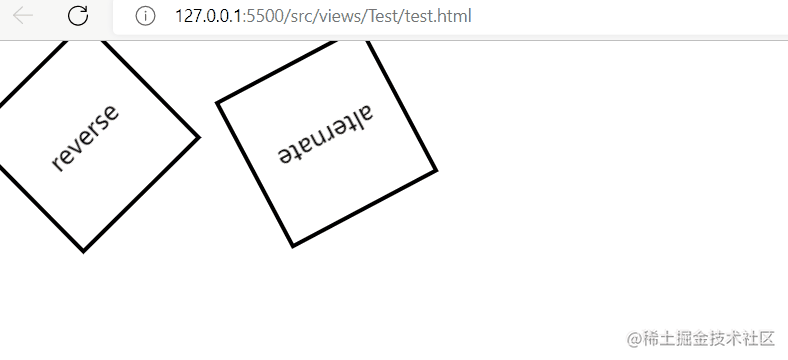
8. animation-direction 是否轮流反向播放动画
animation-direction 属性用来设置是否轮流反向播放动画,属性的可选值如下: 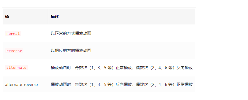 示例代码如下:
<!DOCTYPE html>
<html>
  <head>
    <style>
      @keyframes box {
        0% {
          transform: rotate(0);
        }
        50% {
          transform: rotate(0.5turn);
        }
        100% {
          transform: rotate(1turn);
        }
      }
      div {
        width: 100px;
        height: 100px;
        float: left;
        border: 3px solid black;
        text-align: center;
        line-height: 100px;
        position: relative;
        animation-name: box;
        animation-duration: 2s;
        animation-iteration-count: infinite;
      }
      .one {
        animation-direction: reverse;
      }
      .two {
        margin-left: 50px;
        animation-direction: alternate;
      }
    </style>
  </head>
  <body>
    <div class="one">reverse</div>
    <div class="two">alternate</div>
  </body>
</html>
运行结果如下图所示:
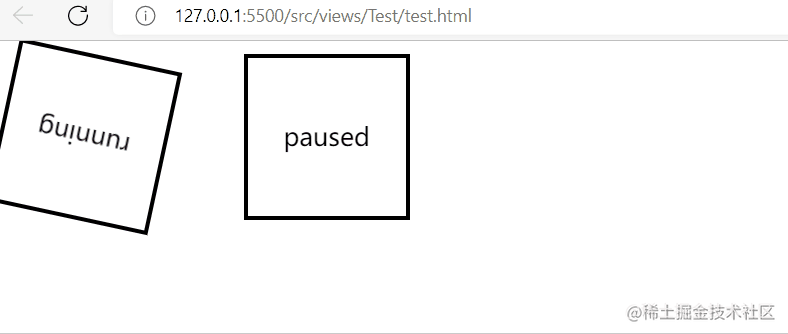
9. animation-play-state 设置动画是播放还是暂停
animation-play-state 属性用来设置动画是播放还是暂停,属性的可选值如下: 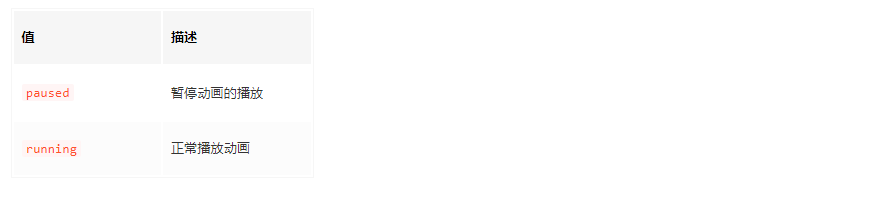
示例代码如下:
<!DOCTYPE html>
<html>
  <head>
    <style>
      @keyframes box {
        0% {
          transform: rotate(0);
        }
        50% {
          transform: rotate(0.5turn);
        }
        100% {
          transform: rotate(1turn);
        }
      }
      div {
        width: 100px;
        height: 100px;
        float: left;
        border: 3px solid black;
        text-align: center;
        line-height: 100px;
        position: relative;
        animation-name: box;
        animation-duration: 2s;
        animation-iteration-count: infinite;
      }
      .one {
        animation-play-state: running;
      }
      .two {
        margin-left: 50px;
        animation-play-state: paused;
      }
    </style>
  </head>
  <body>
    <div class="one">running</div>
    <div class="two">paused</div>
  </body>
</html>
运行结果如下图所示:
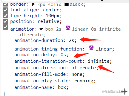
10. animation 简写形式
animation 属性是 animation-name、animation-duration、animation-timing-function、animation-delay、animation-iteration-count、animation-direction、animation-fill-mode、animation-play-state 几个属性的简写形式,通过 animation 属性可以同时定义上述的多个属性,语法格式如下:
示例代码如下:
<!DOCTYPE html>
<html>
  <head>
    <style>
      @keyframes box {
        0% {
          transform: rotate(0);
        }
        50% {
          transform: rotate(0.5turn);
        }
        100% {
          transform: rotate(1turn);
        }
      }
      div {
        width: 100px;
        height: 100px;
        border-radius: 50%;
        float: left;
        border: 3px solid black;
        text-align: center;
        line-height: 100px;
        position: relative;
        animation: box 2s linear 0s infinite alternate;
      }
    </style>
  </head>
  <body>
    <div>animation</div>
  </body>
</html>
运行结果如下图所示:
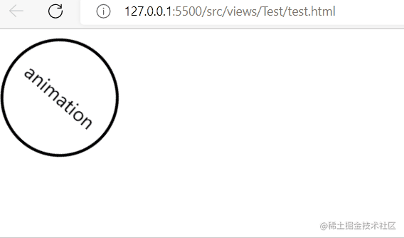 图:animation 属性演示